Selecting Colour Schemes for Open-Plan Kitchen Areas
Table Of Contents
Using Accent Colours Effectively
Accent colours play a pivotal role in enhancing the visual appeal of open-plan kitchen areas. These vibrant hues can create focal points, adding interest and energy to the space. Strategic placement of accent colours, such as on cabinet doors, kitchen islands, or even decorative accessories, draws attention and can make the kitchen feel more inviting. Selecting an accent colour that contrasts or complements the primary colour scheme can help achieve a harmonious look, while also reflecting personal style.
When considering the effectiveness of accent colours, it’s important to remain mindful of the overall design and functionality of the kitchen. Bold colours can energise a space but may need to be balanced with neutral tones to prevent overwhelming the area. Soft pastels can evoke a sense of calm, which is particularly beneficial in a shared living space. Incorporating textures and varying shades alongside accent colours can also add depth, ensuring the kitchen remains stylish yet practical.
Tips for Incorporating Pops of Colour
Incorporating pops of colour into an open-plan kitchen can dramatically enhance its visual appeal. Consider using vibrant accessories like bar stools or kitchen towels to introduce bold hues. This approach allows for flexibility without overwhelming the space. Items such as fruit bowls or decorative jars can also serve as effective colour accents, adding life to countertops and breaking up neutral tones.
Another way to infuse colour is through wall art or statement pieces. A vibrant painting or a quirky clock can draw attention and serve as a conversation starter. Remember to choose colours that harmonise with existing elements in the kitchen, creating a cohesive look. Mixing textures along with these accent colours can add depth and interest, making the space feel more dynamic and inviting.
The Influence of Flooring on Colour Selections
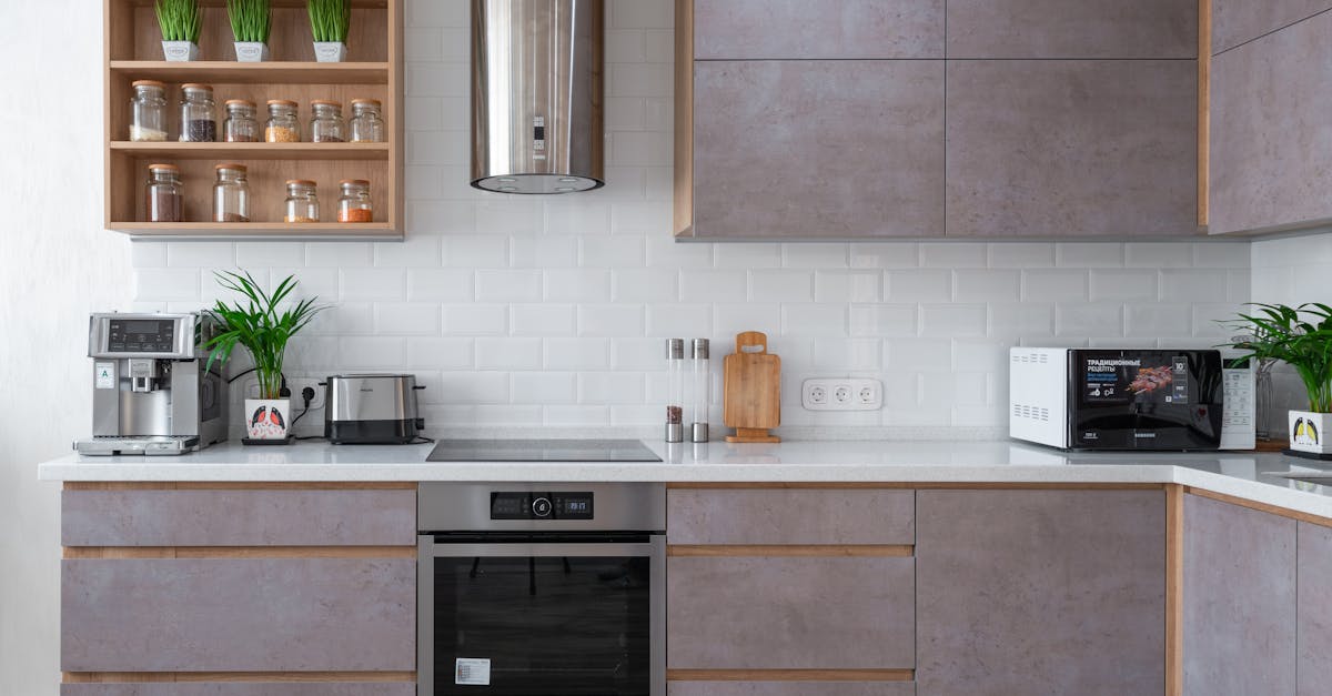
Flooring can significantly impact the overall colour palette of an open-plan kitchen. The hue and texture of the flooring create a foundational backdrop that influences the selection of cabinetry, countertops, and decorative accents. For example, light-coloured timber or ceramic tiles may enhance brighter shades in the kitchen furnishings, while darker flooring can create a more dramatic contrast and call for a different approach to colour choices.
Understanding the material of the flooring also plays a crucial role in colour selection. Natural hues in stone or timber flooring often lend themselves to earthy tones in cabinetry and decor. Conversely, modern materials like polished concrete provide a neutral canvas that can accommodate bold or vibrant colour options. It is essential to consider the overall cohesion between the flooring and the chosen colours to achieve a harmonious look in the open-plan space.
Aligning Kitchen Palettes with Floor Materials
The choice of flooring significantly impacts the overall aesthetic of an open-plan kitchen. Materials like timber, tiles, or vinyl each possess unique colours that can harmonise or contrast with the kitchen palette. For example, warm-tone timber floors can complement richly toned cabinets while providing an inviting atmosphere. Alternatively, sleek porcelain tiles in neutral hues lend a modern edge, especially when paired with vibrant or bold accents in cabinetry or accessories.
Understanding the finish and texture of the flooring is crucial for achieving a cohesive look. Matte finishes typically create a more organic feel, while glossy tiles may inject a sense of sophistication. When selecting paint colours or cabinetry, consider how they relate to the floor. Samples of flooring and potential paint choices can help visualise how light interacts with different materials, ensuring the chosen palette enhances the overall design rather than detracting from it.
Testing Colours Before Committing
Choosing a colour scheme for an open-plan kitchen can significantly impact the overall aesthetic and functionality of the space. Before finalising your decisions, consider testing colours in the actual environment where they will be applied. Bring samples into the kitchen, observing how they interact with natural light at different times of the day. This step allows for a more accurate assessment of how various shades can complement or clash with existing elements in the room.
A practical method for visualising colour schemes involves using paint samples or swatches. Apply these to a small section of the wall to get a true sense of how they look in the space. Alternatively, digital tools and apps offer virtual previews, allowing you to experiment with different combinations without the commitment of actual paint. Such methods can provide deeper insights into how colours will affect the mood of the kitchen while ensuring that the final selection aligns with the overall desired atmosphere.
Methods for Visualising Colour Schemes
Exploring colour schemes in an open-plan kitchen area often begins with utilising paint swatches or digital applications that allow for easy visualisation. Sampling a variety of hues can provide a better understanding of how different shades will interact within the space. Allowing natural light to play a role in this process is crucial, as colours can change dramatically under different lighting conditions. Create a small feature wall or use large poster boards to help imagine how combinations will look when applied in larger areas.
Another effective method is to gather visual inspiration from online platforms or design magazines. Creating a mood board with images of kitchen designs, texture samples, and colour swatches adds a tactile element to the brainstorming process. This approach encourages a broader perspective on design possibilities, allowing for an exploration of style while introducing potential colour pairings. Trial and error in this creative exercise often leads to surprising and unique combinations that resonate with personal taste and lifestyle.
FAQS
What are accent colours and how can I use them in my kitchen?
Accent colours are bold hues that contrast with your main colour scheme, adding a dynamic touch to your kitchen. You can use them through decorative elements like cushions, wall art, or even small appliances to create visual interest.
How can I incorporate pops of colour without overwhelming the space?
Start small by introducing colour through accessories such as rugs, curtains, or decorative items. You can also paint just one wall or choose colourful cabinetry accents to keep the overall look balanced.
How does flooring affect my colour selections for an open-plan kitchen?
Flooring plays a crucial role in the kitchen's overall aesthetic. The colour and material of the floor can influence the tones you choose for walls and cabinetry. It’s best to select a colour palette that complements or contrasts nicely with your flooring to achieve a cohesive look.
What should I consider when aligning kitchen palettes with floor materials?
When aligning colours, consider the undertones in your flooring—warm, cool, or neutral. For instance, if you have warm timber floors, warm tones in your kitchen palette will create harmony, while cool colours can provide a striking contrast.
What methods can I use to test colours before making a final decision?
You can use paint samples on the walls to see how they look in different lighting throughout the day. Additionally, visualising tools like colour swatches or digital design apps can help you see how different colours will interact in your space before committing.
Related Links
Customising Open-Plan Layouts for Family LifestylesCreating Functional Zones in Open-Plan Kitchen Spaces
Enhancing Social Interaction in Open-Plan Cooking Spaces
Incorporating Smart Technology in Open-Plan Kitchen Layouts
Tips for Balancing Style and Functionality in Open-Plan Kitchens
Maximising Natural Light in Open-Plan Kitchen Designs
Choosing the Right Furniture for Open-Plan Kitchens
Benefits of Combining Living Areas with Open-Plan Kitchens
Design Strategies for Seamless Integration in Open-Plan Kitchens